my ability to develop a cohesive brand identity through typography and visual systems. Created as a winery branding concept centered on Italian white wine and the culture surrounding it, the project explores the elegance and craftsmanship associated with wines produced in regions such as Veneto and Tuscany.
The brand, bianco, takes its name from the Italian word for “white,” reinforcing the concept’s focus on crisp, refined white wines. The name reflects simplicity, clarity, and timeless appeal: qualities often associated with classic Italian winemaking traditions.

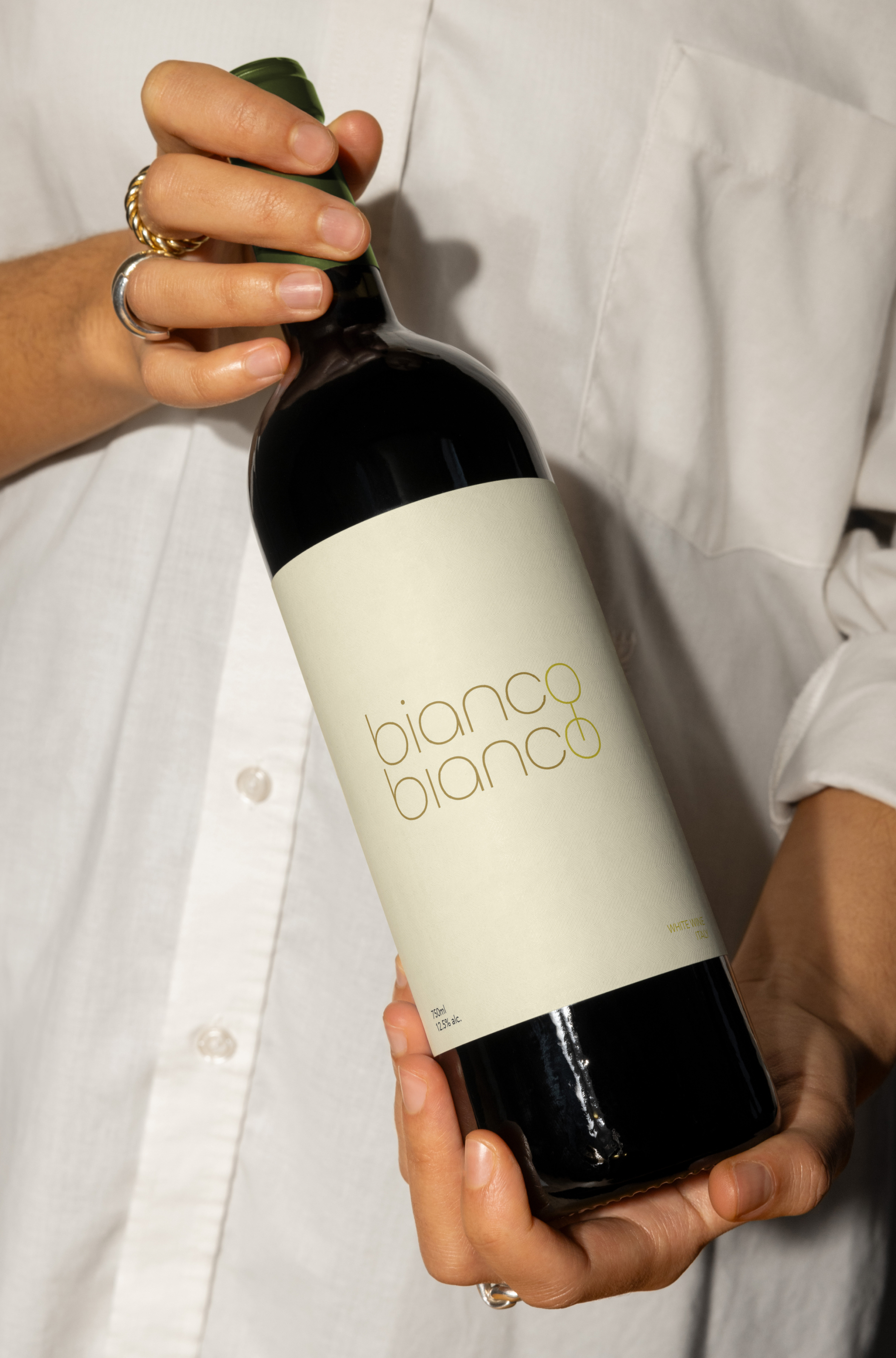




celebrates the sophistication andheritage of Italian wine culture through a clean, contemporary visual language. Designed to evoke the freshness and refinement of white wine, the identity balances tradition with modernity, appealing to young adults and wine enthusiasts seeking an elevated yet approachable brand.
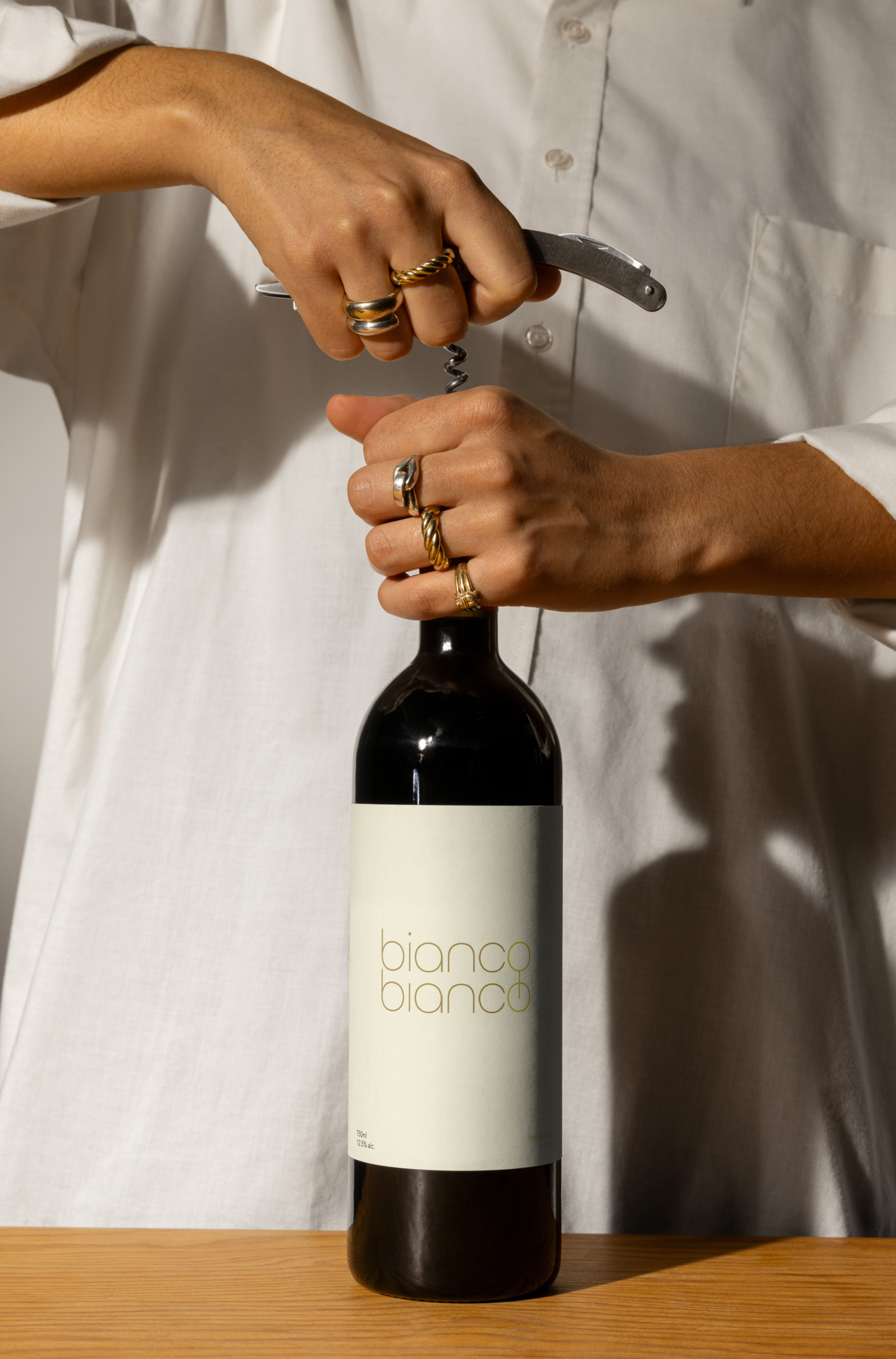
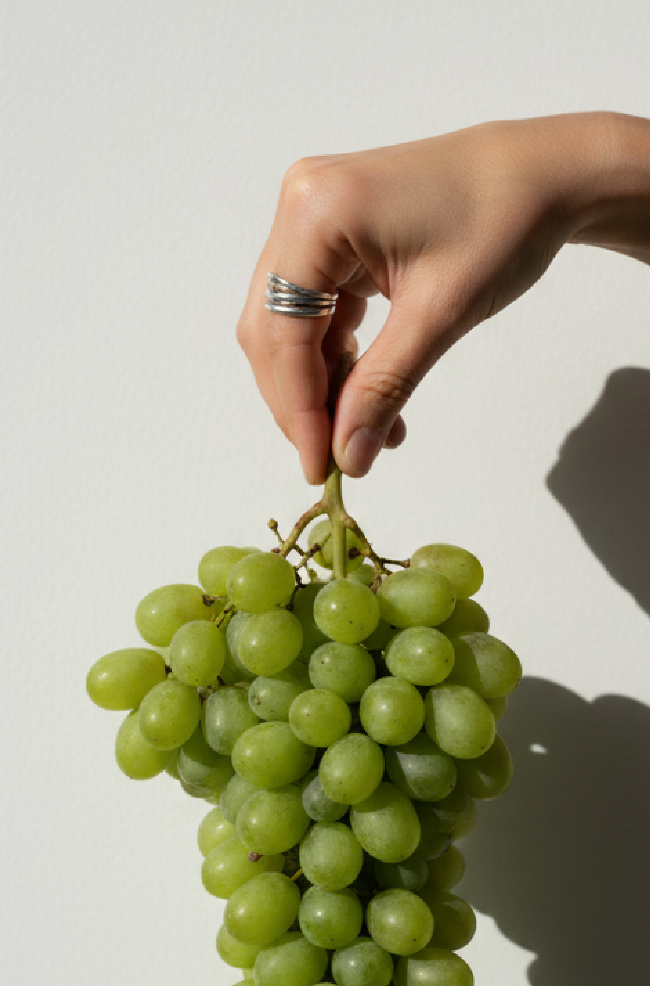
centered on the purity and elegance of Italian white wines, this project establishes a premium. The design system emphasizes minimalism and clarity, allowing the name and typography to become the focal point of the brand while reflecting the understated luxury often associated with fine wines.

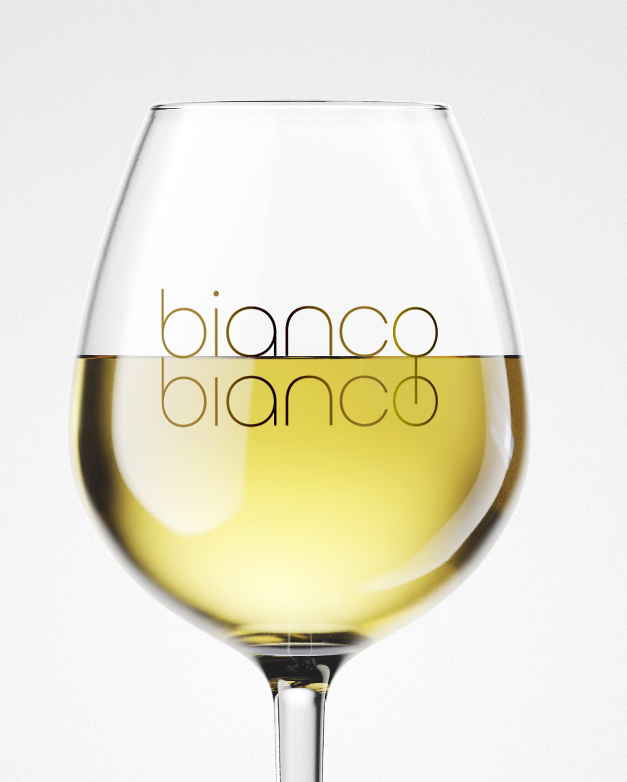
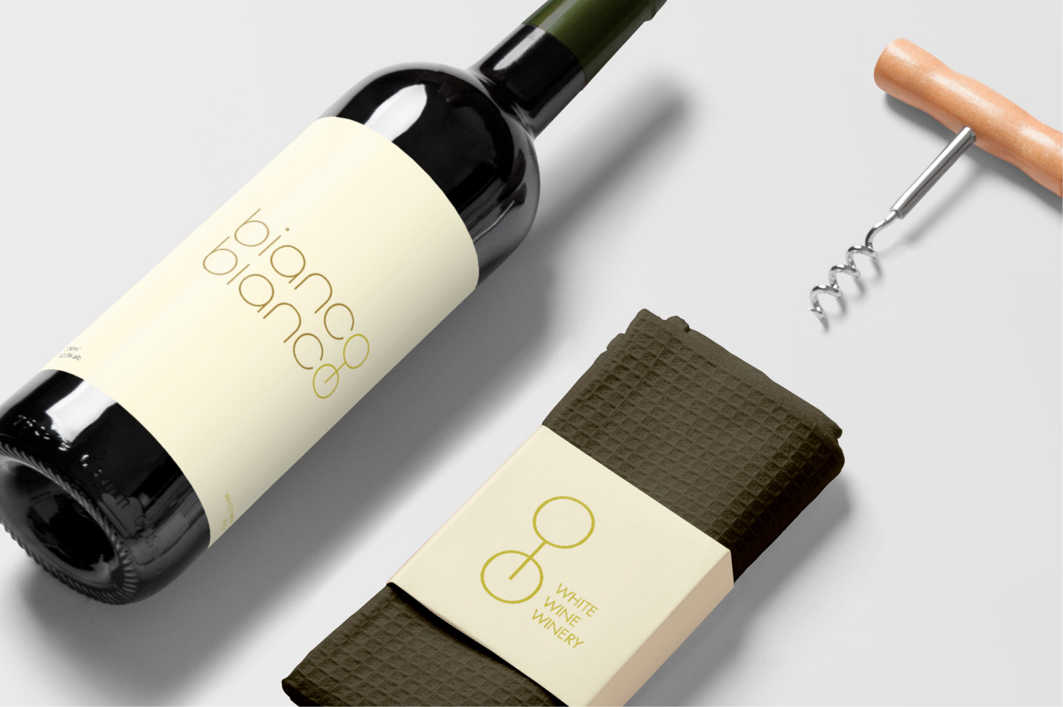
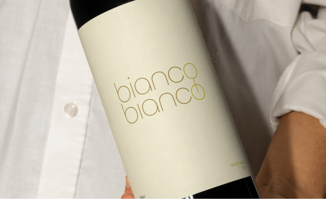
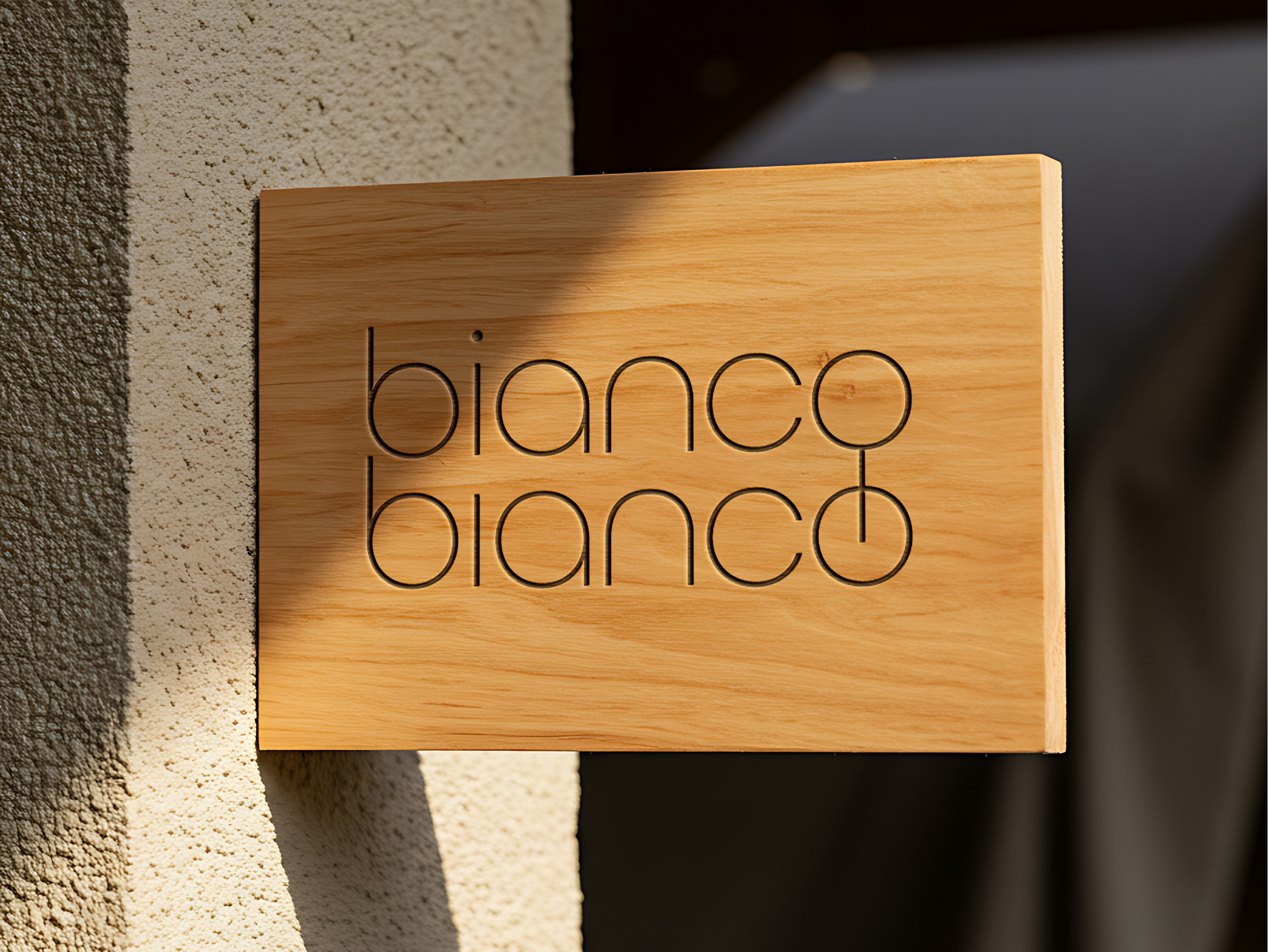
the word bianco is duplicated and aligned, with the two “O”’s connected by a horizontal line to create a subtle visual of a wine glass shape within the typography. This visual gesture reinforces the product category while maintaining a refined and minimal aesthetic.The rounded letterforms were chosen to reference the natural roundness of grapes, while the thin, refined type conveys elegance and sophistication. Together, these elements create a balanced visual identity that communicates both the organic origins of the wine and the refined experience of enjoying it.